Checkout Plus Visual Guide
Visual Representation of Styles
Below is a visual guide that demonstrates how to use custom CSS with select variables. These will affect the look and feel of Corso’s checkout plus components and allow for easy customization.
Checkout Plus Styling Examples
This guide demonstrates how each CSS variable impacts your layout. Every example shows:
- The necessary variable within the Custom CSS field
- An image showcasing the change that will take place
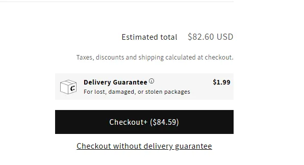
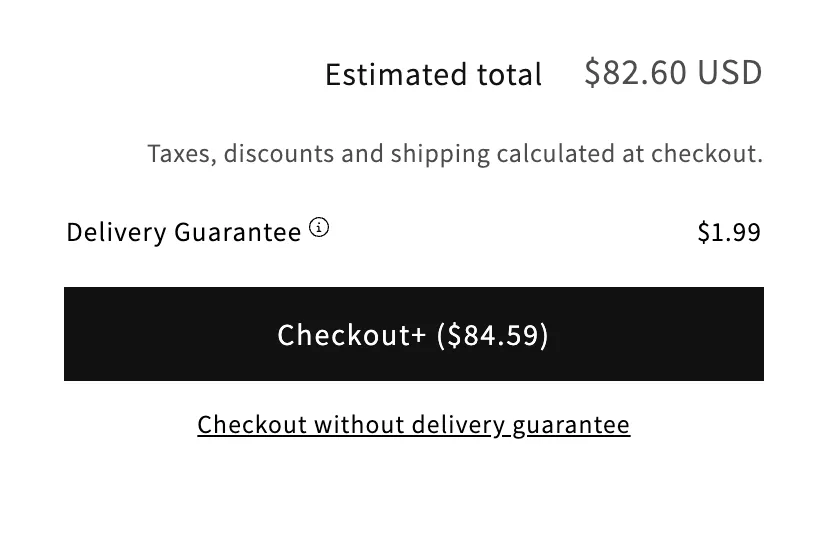
Default Style
Each example begins with this default layout:
How to Apply Styles
Just paste your chosen CSS variable(s) into the Custom CSS field:
Minimal Look
This look uses only the basics for a clean, subtle style.
Example: Minimal Variables
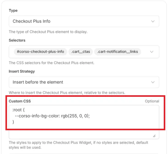
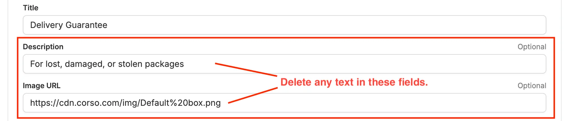
In this instance, you will need to delete the information fields at the bottom of the checkout plus page. Then, add the following CSS variable to the Custom CSS field:
First:
Then:
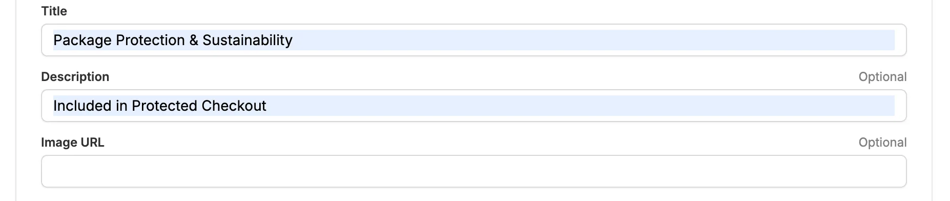
Add the following CSS variable to the Custom CSS field of the Checkout Plus Info section:
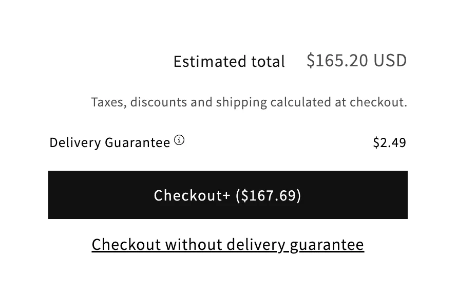
:root { --corso-info-bg-color: transparent; --corso-info-label-font-weight: normal; --corso-info-padding: 0;}It should look similar to this:
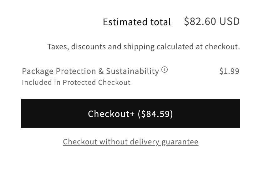
But wait, there’s more!
The opt-out button doesn’t look quite right. To fix this, add the following CSS variable to the Custom CSS field of the Opt-Out Checkout Button section and make it a bit smaller:
:root { --corso-button-font-size: 80%;}Perfect!
Now all the elements blend together nicely.
Further Customization
To further customize the look of your checkout plus, you can add the following CSS variables to the Custom CSS field.
Example: Customization Variables
We want to add a bit more information to our Checkout Plus box, but have everything blend in seamlessly. We can do this by adding the following.
First:
Let’s change the text for our info box:
Then:
Add the following CSS variable to the Custom CSS field of the Checkout Plus Info section:
:root { --corso-info-bg-color: transparent; --corso-info-text-color: #676767; --corso-info-label-font-weight: normal; --corso-info-padding: 0;}And:
Add the following CSS variable to the Custom CSS field of the Opt-Out Checkout Button section:
:root { --corso-button-font-size: 80%; --corso-button-text-color: #676767;}Finally:
Now we have a nice, clean look with a bit more information. Everything blends together nicely, and the text is still easy to read.
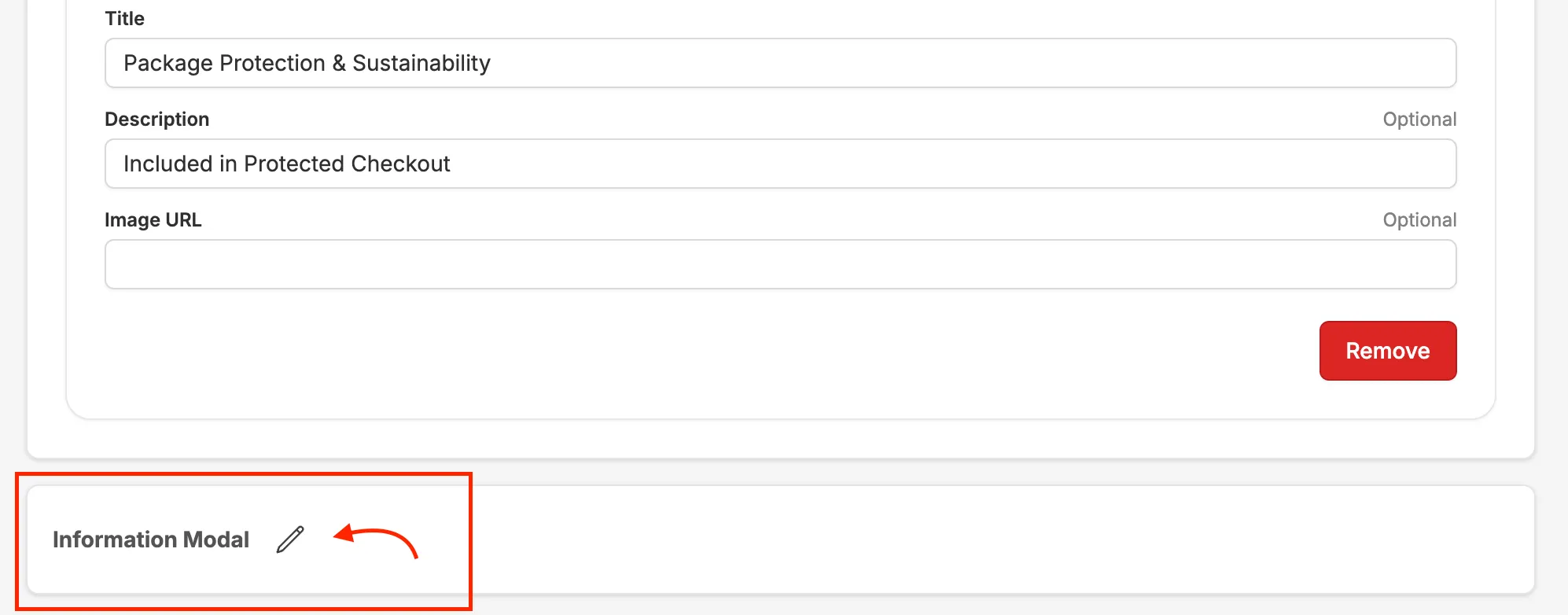
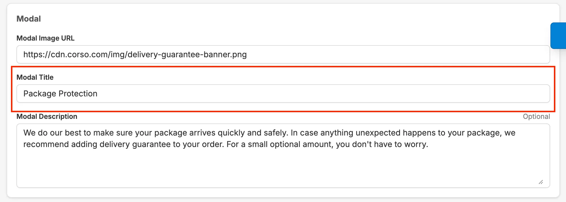
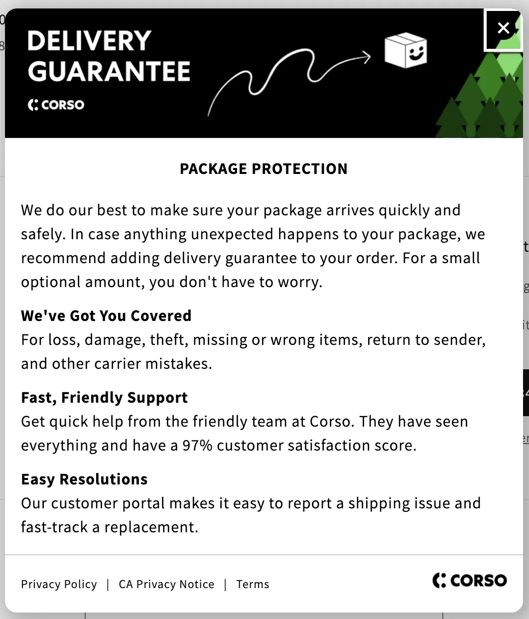
Forgetting Something?
You may want to change the text of the information modal, so it matches the rest of the information we just changed. To do this, you simply hit the “Edit” icon at the bottom of the Checkout Plus page. This will open an additional page where you can change the text.
We recommend changing the title to match the Checkout Plus info box. For example:
And there you have it!
You now have fully customized Checkout Plus elements that match your brand and style!
Extra customization
To further customize each element of Checkout Plus, please refer to the previous page, “Checkout Plus Styling” for a complete list of CSS variables. You can use these variables to adjust the font size, color, and other properties of the Checkout Plus Info Box, Opt-Out Checkout Button, and even the Checkout Plus Modal!